PROJECTS
SPEAKING
DEPLOYED WORK & SHOWS
CHARTING &
GRAPHIC WORK
ESSAYS
GIFTS
UNREALIZED WORK
BACKGROUND
BIOs, IMAGES & CVs
DIDI.COM
CONTACT
COLOPHON
|
|
If you're here to see the artwork mentioned on Science Friday,
please follow this link instead,
much more recent; slightly less rambling.
 elcome to my somewhat informal presence on the Internet. I’m an interaction designer, sometimes teaching at
Columbia University but always working to bring perceptually rationalized interface ideas to Wall Street (where most of my clients are), the design and art worlds (where my work has received some small recognition) and now you, kind reader. I hope my projects are interesting and my ideas are useful to you. I’ll try to keep posting something every month or so, but if I don’t, feel free to nudge me with an e-mail—or better: tell me what was worth the time you gave it and what wasn’t. These notes, images, programs, and gifts are gathered for you; not for me to boast or bore; and I always appreciate the opportunity to tune my offerings.
elcome to my somewhat informal presence on the Internet. I’m an interaction designer, sometimes teaching at
Columbia University but always working to bring perceptually rationalized interface ideas to Wall Street (where most of my clients are), the design and art worlds (where my work has received some small recognition) and now you, kind reader. I hope my projects are interesting and my ideas are useful to you. I’ll try to keep posting something every month or so, but if I don’t, feel free to nudge me with an e-mail—or better: tell me what was worth the time you gave it and what wasn’t. These notes, images, programs, and gifts are gathered for you; not for me to boast or bore; and I always appreciate the opportunity to tune my offerings.
|
|
RECENTLY POSTED ITEMS
|
|
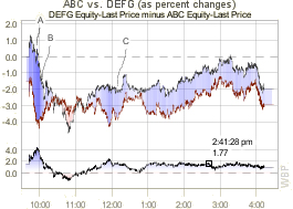 Simple, clean, highly functional charts
I’ve been working on some seemingly simple 2D charts optimized for
instant, low misinterpretation-risk use by Wall Street analysts, portfolio managers, and traders.
Lots of subtle honing helps introduce this information more effortlessly into the
decision-making process. It’s
work in progress, so try ’em out and let me know what to fix or add!
|
|
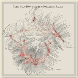 Map of science collaboration:
opens pictorial feature in the journal Nature
Katy Borner's Places & Spaces exhibition (currently
at the New York Hall of Science commissioned an
“illuminated
diagram” presentation of how different paradigms of science
interact and where in the world science gets done. The work was a collaboration between
Kevin Boyack, John Burgoon, Peter Kennard, Dick Klavans, and myself. One of the two images in that display (Kevin's Dick's and my own) was chosen to open the journal Nature's annual pictorial review as a two-page
spread. Follow this link to read a short discussion of the image and related work.
|
|
The New York Stock Exchange: next generation broker’s handheld
After successfully redesigning the Hybrid Specialist's Workstation (see below),
I was asked back to address a potentially more worrisome
bottleneck: real-time order entry by brokers on the floor. In October this
process became much more critical as brokers started trading against
computer-entered trades with the implementation of the
NYSE's
Hybrid Market.
Computer-entered orders clear in well less than a second, while order
entry by hand may take as long as 7-10 seconds.
I'm proud to say that we
may have sped brokers up by an average of 15 times—not 15%—1,500%;
down to less than a second!
(All the more remarkable
because when designing another handheld
device in 2000 I thought we
would never surpass the 1-2 second speed of paper.) The real fun
is just starting: these “concrete information techniques” not only
speed people up, they lower risk and support human overview of perhaps hundreds
of individual orders (or algorithms), greatly outstripping the 7 +- 2
trades one can mentally integrate in contemporary table-based
“blotters.”
(Reports of the demise of of humans in the trading loop are premature:
we’re developing a whole new class of tools.) Patents are pending,
and bank or buy-side inquiries are welcome.
|
|
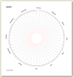 Once more around the sun:
a 2007 calendar gets a gratifying response
In early December I released a reorganized travel-planning and pattern-revealing
calendar: a kind of graph paper for life. It was immediately BoingBoing-ed and
I got rid of over a thousand of them in a couple short weeks, even though the
Web traffic brought its home (the
Information Esthetics site) down
and it remained down for two days to protect other people on the server.
People are still coming back; a remarkable display of persistence in this
fifteen-seconds-of-fame Web world. Go to
that site to read more.
|
|
Information Esthetics: i.e. Lecture Series One (Completed)
People who value clarity and engagement in visual displays, whether as
fine art or on Wall Street, are invited to seven evenings with some of
the field’s deepest thinkers and finest practitioners. The series opens
with distinguished typographer Robert Bringhurst at 6:00 pm, March 31
at the Chelsea Art Museum. Fine spirits and snacks will be served. It’s
free with the $3 discounted museum admission.
InformationEsthetics.org
has details.
|
|
Speaking Engagements: the next few months (Past)
I’ve been asked by people thinking about the i.e.
Lecture Series One when I’ll next speak myself.
I'm proud to be giving two keynote talks: one at
IV05,
the European Information Visuzalization conference
[abstract],
and another
at alt.chi
the ACM CHI subgroup addressing “new topics of research that may be seen as controversial, exciting, or emerging.”
[abstract]
I’m also
doing a seminar at the
Regenstrief Institute, addressing/developing
medical informatics and library science visualizations at the end of April.
Drop me a line if you’re in Indianapolis and this is interesting;
I will see if the venues are open. I also offer a three-day seminar to
commercial firms interested in leveraging my “cognitive engineering”
techniques and methodology, which I have seen
greatly improve clarity and productivity; it’s essentially a
condensed and tailored version of my class at Columbia.
|
|
The New York Stock Exchange: next generation specialist’s workstation
I currently have the privilege of working on a project at the center of world finance, the New
York Stock Exchange, as lead interaction designer of the next generation
specialist’s workstation: the center of exchange floor operations. It’s
a doubly fascinating project exercising my interests in both information
visualization and perceptually-aware special-purpose user interfaces.
As the NYSE moves towards a hybrid market, machine-fast automatic executions will
be balanced with the value human specialists bring to the market. Think of
flickering bids and asks matching into trades, feeding rivers of tick data
(InfoVis), and unusual or important trades being quickly and carefully worked by hand (UI). Truly
exciting work, allowing—even demanding—interface innovations. Fun stuff.
|
|
Edward Tufte: “Sparklines” chapter in Beautiful Evidence
 I worked a little with Edward Tufte on a chapter in
his upcoming book devoted to tiny,
contextualized, self-labelling graphics he calls “Sparklines.”
It was a pleasure exploring this
immediately applicable
territory with E.T., a charming and clear-thinking man with whom I agree on
many information presentation techniques. Take a look at the new
Sparklines chapter
on his own site.
I worked a little with Edward Tufte on a chapter in
his upcoming book devoted to tiny,
contextualized, self-labelling graphics he calls “Sparklines.”
It was a pleasure exploring this
immediately applicable
territory with E.T., a charming and clear-thinking man with whom I agree on
many information presentation techniques. Take a look at the new
Sparklines chapter
on his own site.
|
|
TraceEncounters: exploring social networks at Ars Electronica
I was asked to speak at Ars Electronica this year, the festival at which I’ve heard the highest level of discourse about the often ghettoized world of electronic art. Since I like to do work that’s relevant and interesting to my audience, I developed a proposal to Gerfried Stocker for an information visualization (I was asked to speak about infovis) of a nearby social network: the core thousand people attending the festival this year. I tapped the accomplished and creative electrical enginner Jeff Han to help develop a simple hardware stickpin, themed after Victorian silver and marcasite jewlery, that could remember every other such pin it saw. Peter Kennard joined us and did exceptional
work coding what amounted to a tiny (4k!) operating system on the pin. It seemed to capture people’s
imaginations at the festival, and we may well do it again. Please look at the
TraceEncounters Web site for details and updates.
|
|
A Simulation/Reenactment Pipeline: abstracting abstraction
Sarah Diamond’s fun and valuable summit meetings often leave lasting ripples in my outlook and work. This year’s Simulation/Reenactment summit found me leading a small group into trying to create a sketch of a map of the territory we explored: the act of abstracting and recreating for scientific (simulation) or cultural (reenactment) ends. Maybe you’ll find this playful walk-through of our pipeline a good starting point for your own thoughts on the process.
|
|
 Clear FX: a quiet & radical new foreign exchange system
One of the largest investment banks had the need to rebuild their foreign exchange system and the vision to explore the kind of perceptual/psychological “business-side technology” I champion. This design, deploying this very month, shoehorns wide-ranging innovations into the generally constraining Wall Street design vernacular of grids, rectangular data-entry fields, buttons, and scrollbars; turns out it’s not a bad fit after all. I'm proudest when the innovations are far-reaching but the presentation is simple. Here, salespeople and traders helped create the look so they’re accepting radical changes to the interface as if they’ve worked with it for years—and they have: it’s just an illustration of the business practices they spent decades mastering. A quiet revolution. It’s unpublished for now, but contact me for a personal demonstration if you have an academic or commercial interest.
|
|
 DataView: steps toward expressive data maps
This is an interaction sketch: working Java code that allows me to test out various ways people might create data diagrams that are more expressive than the overly abstract circles and lines we commonly see representing entities and relationships. It allows the person exploring the data to sketch simple node boundaries in any shape—one that expresses the data, if possible—then drag data elements from an XML heirarchy to associate the data with the drawing. (First publicly shown during my
keynote talk at InfoVis 2003.)
|
|
My previous home page: even less formatted than this one
Just in case you're looking for something specific that I haven’t brought
into this new format, here’s the old home page.
|
|
|

 elcome to my somewhat informal presence on the Internet. I’m an interaction designer, sometimes teaching at
Columbia University but always working to bring perceptually rationalized interface ideas to Wall Street (where most of my clients are), the design and art worlds (where my work has received some small recognition) and now you, kind reader. I hope my projects are interesting and my ideas are useful to you. I’ll try to keep posting something every month or so, but if I don’t, feel free to nudge me with an e-mail—or better: tell me what was worth the time you gave it and what wasn’t. These notes, images, programs, and gifts are gathered for you; not for me to boast or bore; and I always appreciate the opportunity to tune my offerings.
elcome to my somewhat informal presence on the Internet. I’m an interaction designer, sometimes teaching at
Columbia University but always working to bring perceptually rationalized interface ideas to Wall Street (where most of my clients are), the design and art worlds (where my work has received some small recognition) and now you, kind reader. I hope my projects are interesting and my ideas are useful to you. I’ll try to keep posting something every month or so, but if I don’t, feel free to nudge me with an e-mail—or better: tell me what was worth the time you gave it and what wasn’t. These notes, images, programs, and gifts are gathered for you; not for me to boast or bore; and I always appreciate the opportunity to tune my offerings.