|
Though I’m not officially a graphic artist, some of my work might be
categorized as belonging to that fine tradition. Here are some examples
of toys, tools, or explorations I’ve done that have that presence.
|
|
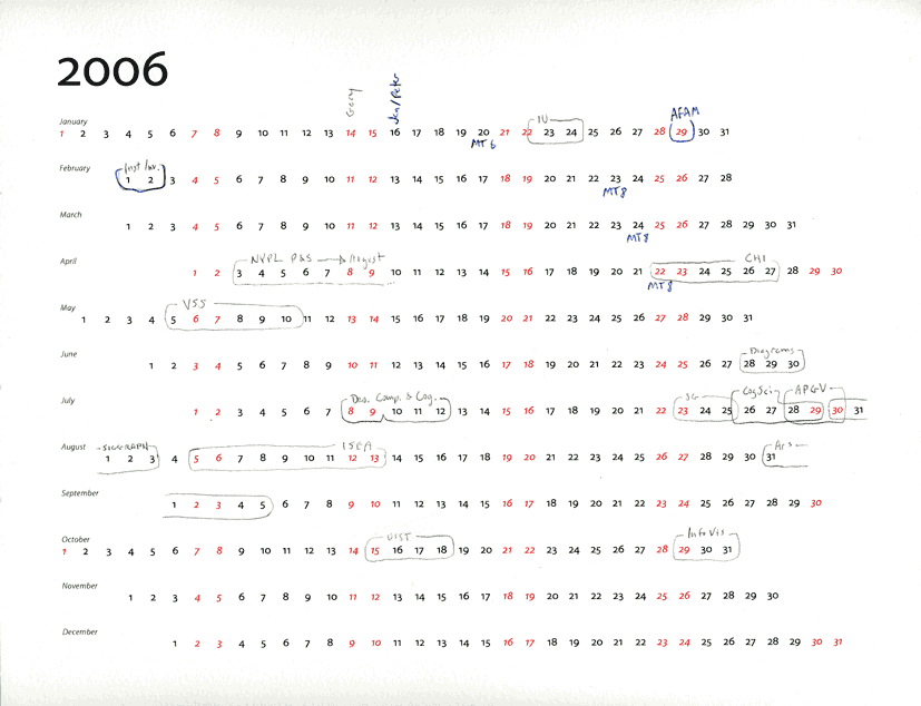
Arranging the days in a year specifically for travel planning
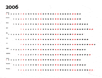
I couldn’t find a simple enough calendar to draw on to manage
possibly conflicting travel and conference dates, so I typeset one
for myself.
It’s intentionally very plain looking
to allow the scribbles, circlings, and annotations that will give
it its functionality and visual life.
Its layout was designed to keep
few breaks (and only culturally meaningful ones) in the numbers—allowing
circled date ranges to stay contiguous more often.
Note the distinction between
pencilled-in conferences and ballpoint blue confirmed appearances
in the marked example (the right hand image above);
I am sure you’ll come up with a visual language that’s appropriate
for your own needs, if you choose to print one out. Who needs sunsets and pinups
when you can turn the meaningful variations in your own schedule
into a satisfying visual pattern?
|
|
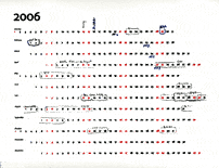
Artsy goofing around with typeface outlines
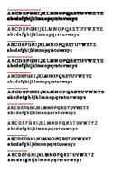
One Tuesday not long ago I downloaded the FreeType C library which allowed me to
directly access outlines of fonts a generous soul at Adobe provided a few months
before. I scaled each face to match a prototype (drawn in red) by comparing heights
of upper case letters, then slid each character along the baseline until as
little as possible was outside the overlap of the prototype and new characters.
That Sunday I had some interesting ghosts to look at: comparisons of letterforms
that hundreds of people spend untold amounts of time on; themselves transcribing
written and printed forms that took millennia to evolve.
(Be careful clicking on that second thumbnail above: it’s linked
to a 4 Mb PDF that draws 166 faces on top of one another. It brings
Acrobat almost to its knees; but it’s great fun to zoom in really
close and look at how the individual letters compare.)
I'm enthralled by the approximating traces—especially in the lower case ‘g’
in the oldstyle faces—it reminds me of Giacometti’s searching line. He was
obsessed by finding the perceptual boundaries around physical objects, as I am around
“thought objects” like letters. I’m amused by the
upper case ‘J’ wagging its
tail, and the ‘Q’ with a blur of support like
Balla’s “Dynamism of a Dog on a
Leash.” But I’m wondering how (whether?) this can support careful thought about
what makes a character recognizable or gives type its almost human personality
on the page.
In fact, people seem to recognize characters the same way they recognize faces:
as a set of features, rather than the averaged-together gestalts that this
exploration suggests. If you want to follow up on
the real science of letter recognition, take a look at
Denis Pelli’s fascinating
work on the subject, especially
Identifying Letters
at the top of his publications page at the time of this writing.
|
|
Sparklines work with Edward Tufte
I worked with Edward Tufte a little to help illustrate his
essay on
“sparklines:” small, intense, word-sized graphics that live
easily in a text-covered page or grid. This is a link to my
page of sparklines work, if
you’re interested in the raw output of my tiny graph generator (hacked from
my “Visual Spreadsheet” work dating back to 1994).
|
|
LifeLines: a proposal for a low-affect monument

Detail: simulated image of Ubatuba granite with carved lines and names (refuge view)
|
|

Schematic drawing for front: facing the park from a small rise (prospect view)
|
|

Schematic drawing for back: forming a 15 foot wide passage with the park’s wall (refuge view)
|
I was twelve blocks away and watching when the World Trade Center towers
collapsed and I came to terms with the enormity of the event in my own
way, saddened and disgusted with the politicized media circus that followed
within hours. Andy Silverman, a broker (at that time) on the floor of the
New York Stock Exchange was even closer. When he suggested we enter
the competition for a monument I tried to decline but he cornered me by
saying “If you think you can make a more respectful one, it’s
your responsibility to.”
A simple design came out
of conversations with Andy and later Marc Pittsley.
It was among the several thousand not chosen, but schematic sketches
(made from the most of the actual names and birthdates) of the
front and back were hung at InfoVis 03. I believe that data
can sometimes speak for itself;
that the role of the monument designer is to step out of the way of the
pilgrim’s reflections; that most current must-be-explained design
refers to more the architect than the subject. I believe that the stories
people take home should be about the emotional closure they find; not
shiny spikey glass and glowing lights. I'm afraid most don't agree, but
at least
Ben Shedd,
a new friend from that InfoVis told me it literally brought tears to his eyes.
|
|
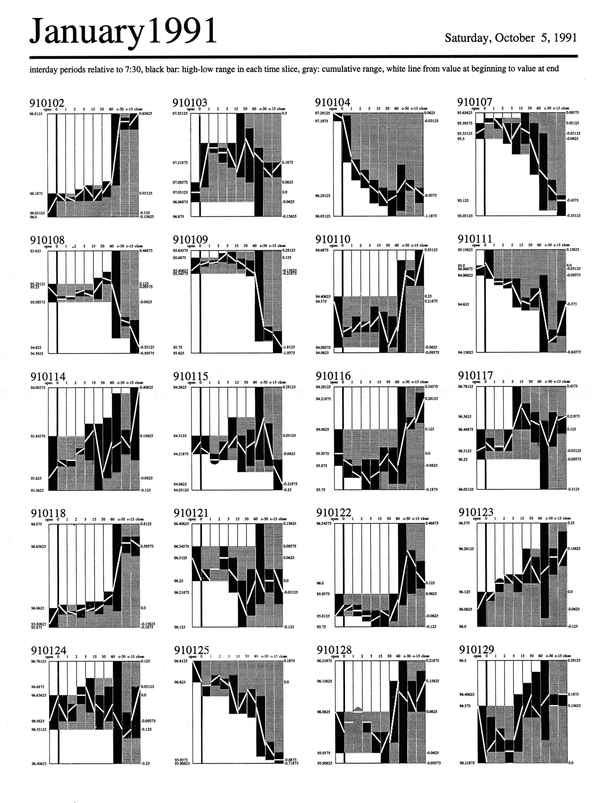
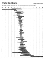
Turning a chart into a glyph to help people recognize similar market reactions

On certain days in the financial world, “information days,” important
information is released—e.g., numbers that say whether a company hit its
profit projections, or news that a company has moved to a higher D&B credit rating.
If you knew how the market reacted to a certian kind of news, you would be better
prepared to react yourself, making money by buying just before the market goes
up, for example.
So the important issues to bring forward are: 1) when the information was
released; 2) the shape of the market’s reaction (flat? up? down, then up ten
minutes later?); and 3) whether that reaction was consistent enough to bet
on. These steps in the analysis task turned into visual features in this way:
1) The exact moment of the visualization is shown as a vertical line, like
all other moments in the tiny charts, but that line was drawn darker to be
a visual landmark. Note (click to see a larger image) that the time slices
increase in size as the day
goes on, since the market might react more sluggishly the farther we get from
the moment the news gets out. And that the time slices are in human-friendly
numbers understood by traders (and perhaps therefore affecting the reactions
in the market: imagine some program set to trade 5 minutes after news), not
the log scale beloved by mathematicians and scientists. Sometimes culturally
appropriate numbers are more accurate than analytic ones (as well as more meaningful).
2) The range of movement in each time slice is drawn in full black, so that
analysts can easily see both that range and how it relates to all the ranges
before and after it. (Gray showed the cumulative range; perhaps confusingly.)
3) These black time ranges perceptually group into a stepped shape, designed
so that when dozens of these shapes were drawn on the same page analysts
could see which ones looked similar. If enough looked similar, they could say
that the market reacted consistently.
To work, this requires data from information days and the exact time of the
news, but the test data here was just every day in January, 1991. Nonetheless,
you might be able to see (in this only modestly successful representation)
how the leftmost glyphs in the first and fourth row are very similar; we would
want most of a page to have glyphs of roughly the same shape.
Looking back at this fifteen years later, I remember that it was perhaps
more successful in a different way: after I explained it to the woman who wrote
up our research for our internal funders, she asked for a copy. I said I
wanted to give her a real, working copy: one already filtered down to include only
one type of information day. Amused, she said not to worry—she just wanted to
hang it in her cubicle because she liked the way it looked. This was one
of my first brushes with what I came to call
“information
esthetics:” the idea that a clear representation of even
abstract data could be attractive and moving—because its clarity reflected
the beauty in the structure of the data. A gratifying moment; then and now.
|
|
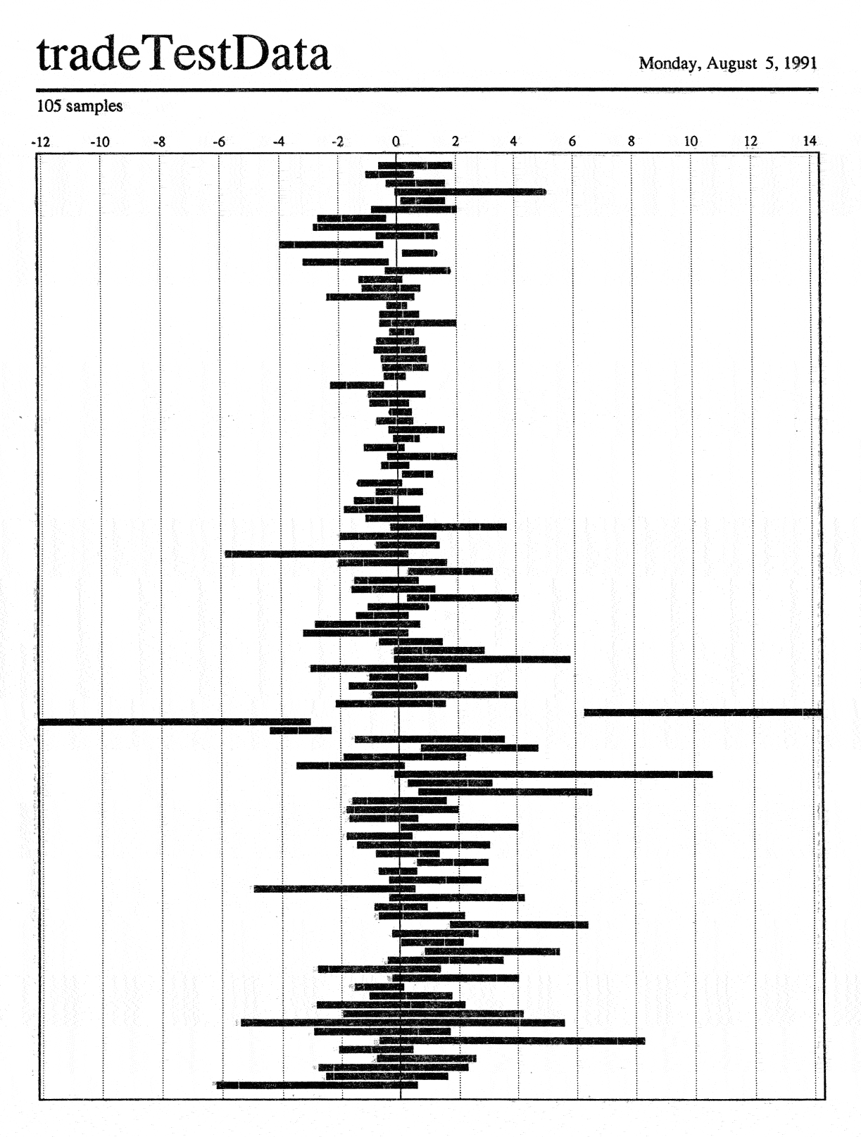
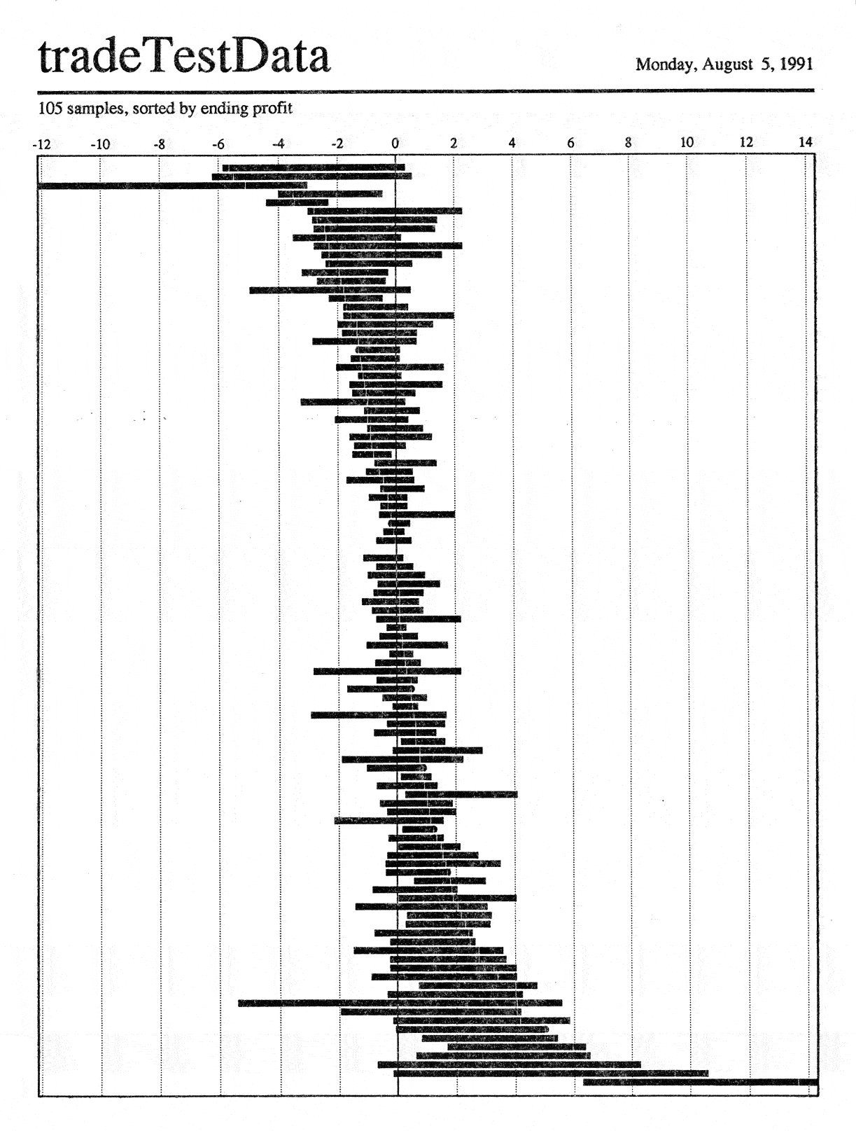
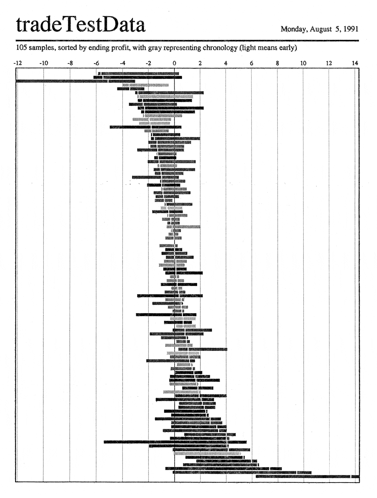
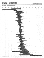
Rearranging time-based ranges to allow algorithm validation
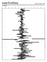
I developed this visual tool to help people determine whether adding
risk-reducing rules to a “black box” trading algorithm would
make it more profitable. The new rules being considered were a
stop loss (“if the price gets this low sell immediately
because we think it’ll go much lower”) and a profit goal
(“if it gets this high that’s all we needed and we
don’t think it’ll go much higher, so sell immediately”).
Horizontal bars are drawn in real dollars relative to the purchase price,
so the index along the top shows exactly how much was made or lost on each
share. They extend from the lowest to the highest (relative) price at which
the stock traded while it was held by the algorithm.
There’s a white hair line inside each bar that shows the price at
the time the algorithm chose to sell. (This is barely visible in the full-size scan;
click to see it. These were all designed for then-standard 300 dpi
laser printers, and the hair line was tuned to be easily visible but
not interfere with judgement of the black area, which was proportional
to the total profit or loss taken). I drew a semicircular “cap”
on the bar if the sale price was exactly at the top or bottom of the range.
In the first image I simply drew the trade ranges in time order—you
can see something of a cyclical variation in the two and a half bulges
reading from the top; in fact the data was two and a half years worth.
The second rearranges the data by the amount of profit taken: see the
hair line advance from losses to profits as you move down the page
(again, visible only in the full-sized image). The third
images shades the ranges by time: early trades are light, later ones
dark. There is some indication that the darker trades group toward
the bottom: this would lead to the testable hypothesis that the
algorithm did better in the market conditions prevalent toward the
end of the time span.
This “paper machine” worked in the following way: an analyst
would move a pencil or ruler, held vertically across the bars, from the far
right slowly towards the left and look at the amount of profit (black area)
that would result if the algorithm used the ruler’s position as a profit
goal. (We assumed we could sell immediately at that exact
number, or at least that the deviations would be minimal or balanced.) If
the amount of profit added by the profit goal (black area to the left of
the ruler and the right of the hair line) was larger than the profit
forgone (area to the right of the ruler and the left of the hair line)
This is work done with Hezzie Lamdan, and ironically it led to its
own demise—a result I ironically consider a triumph of visualization.
After seeing dozens of the marked and folded printouts around his desk
for a few weeks, there were suddenly none. When I asked if I needed to
adapt the tool to some change in the process, he said no; that after
using it for a while he realized he could code this analysis technique
into a meta-layer in the black box, and didn’t need the paper any more.
Why is this a good thing? Because the visualization made it possible
to understand the analysis technique better, by virtue of its clarity,
and provided Hezzie the intellectual foundation that allowed him to
do a deeper kind of analysis.
|
|
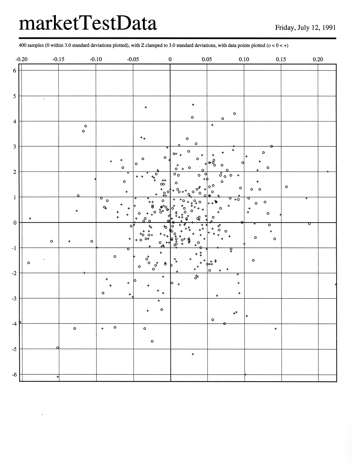
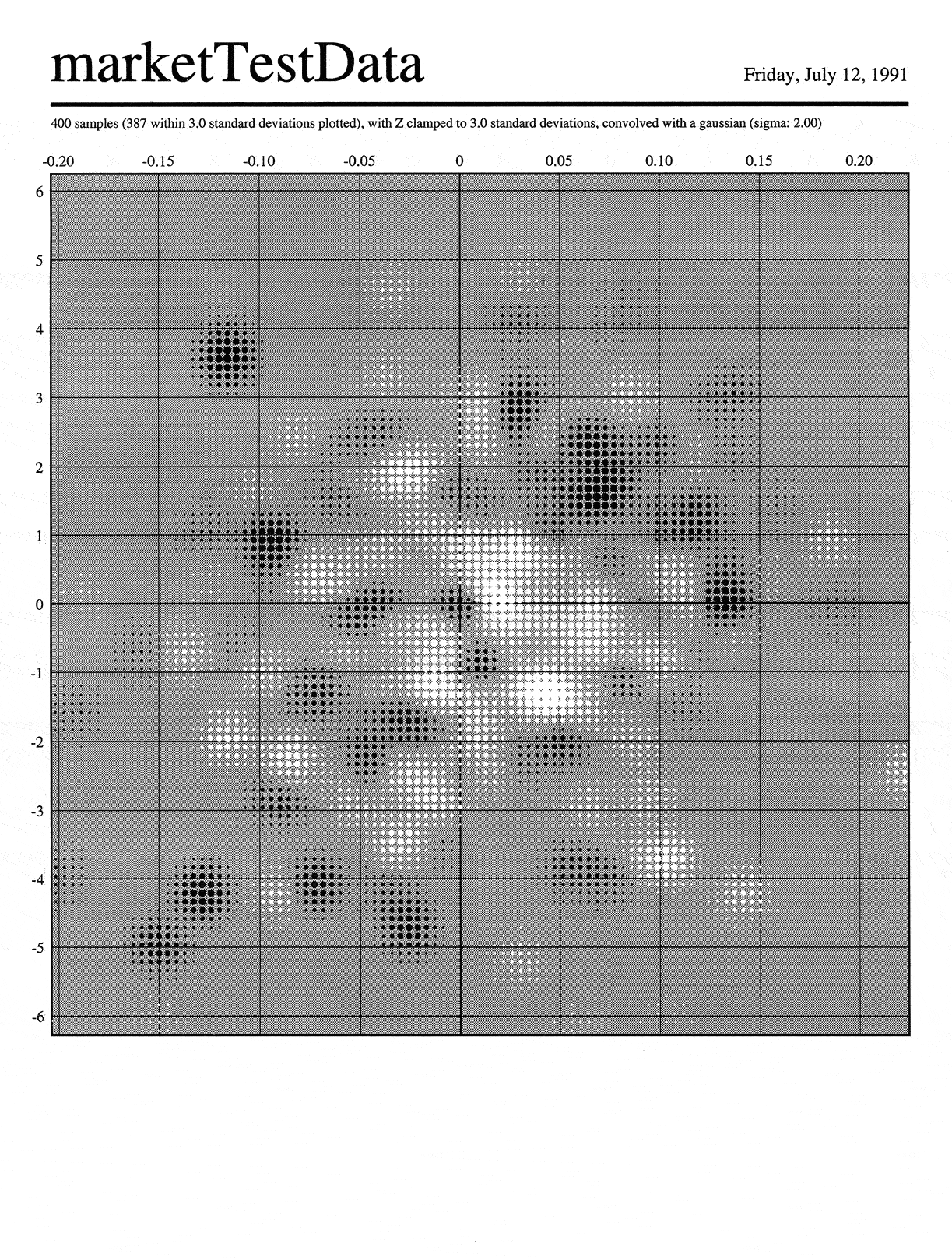
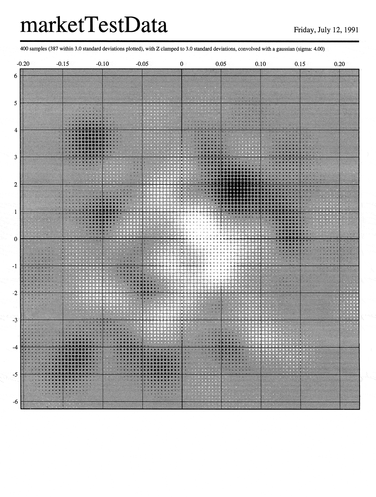
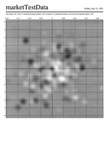
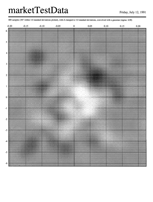
Blurring a scatter plot to find consistent areas
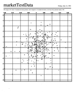
The goal of this visual manipulation was to make it easier to find areas
where there were more positive points in a scatter plot (marked with a ‘+’
in the image) and others where there were more negative points (marked
with ‘o’, since ‘-’ was too visually similar). We (Hezzie Lamdan and I)
realized that simply blurring the image (“convolving each data point impulse
with a Gaussian”) would address two issues simultaneously. It would reduce
the visual noise—the main thing that was making comparing the positive
and negative points difficult. (It was even harder before I got there, when
just ‘+’ and ‘-’ were used.) And in the domain of the data, it would allow
neighboring points, in a local area, to balance one another out: e.g., three
small negatives might have been okay in this analysis if they were right
next to a very large, more than offsetting, positive.
This is an interesting
case where the visual solution (reduce noise) and the analytical need
(offset neighboring data points) were solved by the same operation,
played out in the two domains (blur vs. convolve). This is more than a
lucky coincidence; it happened because the representation was a direct
and accurate transcription of the data, as structured by the
needs of the analytical task.
The first image is my re-drawn scatter plot, the second shows the same data
convolved with a small-radius Gaussian, the third with a larger-radius Gaussian.
Note how if I tell you that the white areas are the positive ones and the
black negative, the third image makes identifying consistent areas trivial.
(Click on the images to compare higher resolution versions.)
|
|
All the work and images on and linked from this page © W. Bradford
Paley, 1991–2006; all rights are reserved. But call me if you want to use them or
invent new ones with me more specific to your own tasks: this can be great fun to do!
|