|
Update: This has now been published in many more places: the original Nature article,
Discover Magazine, SEED, Geo, the Eastern European Edition and India, Brazil, etc.,
and more books and papers.
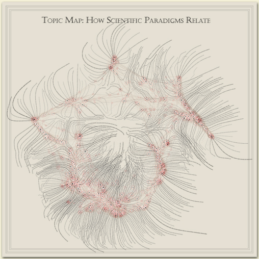
Since the image has proven to be popular (we still get print & publication
requests, four lears later!), I decided to rework the existing image layers, modifying
only the graphical representation—no structure—to see whether I could
improve the information layering and remedy some of the faults I outline at the bottom
of this page. Here's the new version:
I was surprised at how much clearer it could be made. I think the new one has many
of the structural faults I outlined below, but improves several things:
- Fewer distracting lines: nodes are now a single visual element rather than an outline and
a central dot. They’re also more object-like, being filled areas rather than outlines.
- Cleaner look: I gave up on representing all the individual papers as tiny white
dots (which required the background to be significantly darker than white)
- The labels are still the same shape—and still unnecessarily hairy—but I pushed
them into the background by printing them in gray and drawing more attention to the
nodes with color. The results is that the structure of the data is much more prominent,
as it should be.
- I used a more modern typeface (Myriad Pro) and layout, backing off the more “antique
map” effect I was going for before. I still think 200-year-old engravings are
better at representing data than almost every contemporary InfoVis trick, but we can
learn from how they differentiated data categories visually and follow the same
processes within more current typographic fashion.
What follows is the original posting.

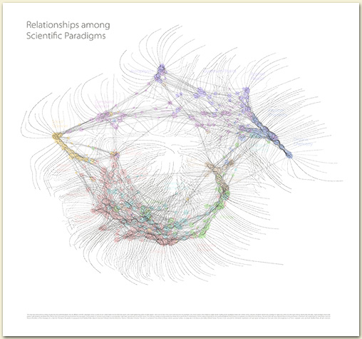
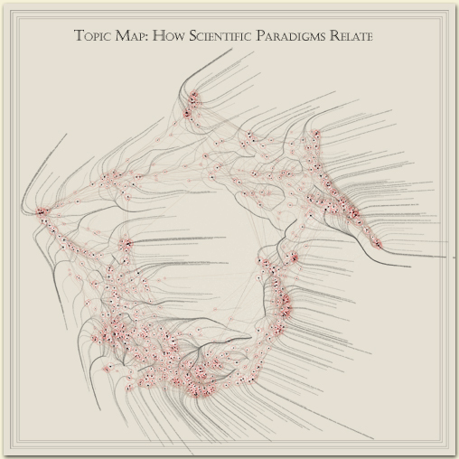
The journal Nature chose an image that spatially lays
out different areas of science in a plane. It is a reduction
of a large-format (42" x 43") paper print.
As to what the image depicts, it was constructed by sorting roughly 800,000 scientific papers (shown as white dots) into 776 different scientific paradigms (red circular nodes) based on how often the papers were cited together by authors of other papers. Links (curved lines) were made between the paradigms that shared common members, then treated as rubber bands, holding similar paradigms nearer one another when a physical simulation had every paradigm repel every other: thus the layout derives directly from the data. Larger paradigms have more papers. Labels list common words unique to each paradigm.
Research and node layout by Kevin Boyack and
Dick Klavans; data from Thompson ISI; graphics & typography by W. Bradford Paley. Commissioned and partially supported by Katy Borner and the Places and Spaces: Mapping Science exhibition.
Copyright (c) 2006 W. Bradford Paley, all rights reserved. (But you may print a version for personal use, and optionally donate to i|e or Places & Spaces if you want to be a good infosphere citizen.)
 A sad proportion of “art/science” illustrations
are more show than tool, evoking but not helping to explain
the phenomena that are supposed to be their subjects.
This map
and variations on it are a distinct counterpoint: they
are used daily as a tool by Dick Klavans
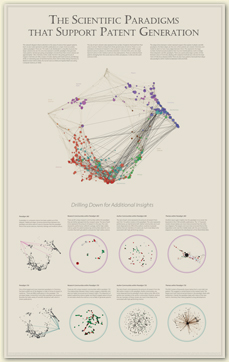
to determine such things as which areas of science are most
closely connected to one another, are most and least
intellectually vital, or which scientific areas produce the
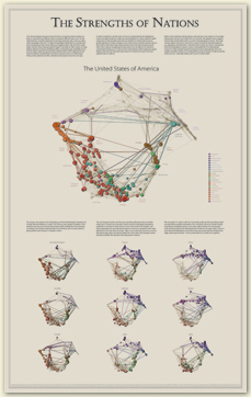
most patents. Here’s an image on which he and I collaborated
(again, with Kevin Boyack’s help & ISI’s data) that discusses
the variations in how different nations pursue science.
A sad proportion of “art/science” illustrations
are more show than tool, evoking but not helping to explain
the phenomena that are supposed to be their subjects.
This map
and variations on it are a distinct counterpoint: they
are used daily as a tool by Dick Klavans
to determine such things as which areas of science are most
closely connected to one another, are most and least
intellectually vital, or which scientific areas produce the
most patents. Here’s an image on which he and I collaborated
(again, with Kevin Boyack’s help & ISI’s data) that discusses
the variations in how different nations pursue science.
This second poster shows which scientific areas produce the
most patents.
 Even at this gross reduction, you can see image variations relating to
how the US treats science (the large map: heavy in the Medical
Sciences at the lower left) and, say, China (top of the
rightmost column: heavy in Physics,
the nodes at the upper right). But Dick’s concise and illuminating
tours thorough the representation are a pleasure to read, and
a boon for a data illustrator like myself who loves to have
experts guide me through data sets to help me foreground
what’s important. (It’s always a warning sign in my mind when
someone says: here’s my data—what can you find in it?...)
Click on the image to get a very large one (the original is
roughly 24" x 39" that lets you read the stories.
Even at this gross reduction, you can see image variations relating to
how the US treats science (the large map: heavy in the Medical
Sciences at the lower left) and, say, China (top of the
rightmost column: heavy in Physics,
the nodes at the upper right). But Dick’s concise and illuminating
tours thorough the representation are a pleasure to read, and
a boon for a data illustrator like myself who loves to have
experts guide me through data sets to help me foreground
what’s important. (It’s always a warning sign in my mind when
someone says: here’s my data—what can you find in it?...)
Click on the image to get a very large one (the original is
roughly 24" x 39" that lets you read the stories.
Some have shown interest in how the image
was created and what I think of it. Here are some notes.
Pictorial/communicative inspirations:
- Antique maps carefully wrapped text along features in the
geography: this save space (if the features were
spatially seperated the labels stayed in the vicinity of the
feature, not complicating the labling of other features)
- It also helped tie the label more firmly to the geographic
feature: I’d suggest that the cognitive binding of
perceptually-related objects (especially objects next to one
another and with similar shapes) is stronger than that of
labels that are merely nearby or point at the feature
- Note that for this image the features are only dots,
and are so tightly packed that I couldn’t do what I think
optimal: track the feature shape as a river name tracks the
river in antique maps, so I fall back at pointing at the node,
but at least don’t use callout lines
Algorithm description:
- Sometimes the pictorial description suggests an
implementation. I imagined the labels as flowing downhill
away from the nodes—now, how do I create that terrain?
- Here, I first thought of the base map
as on a tabletop and each node as a
tall spike (with height proportional to node size), coming up from the table
- Then I convolved those spikes with Gaussian bumps with a
very large Rho (or diameter) approximately 1/4 the size of the image
- (I later put in a smaller, steeper Gaussian on top (say, 1/20 the
width of the image), to help bend the label paths more strongly away
from nearby notes in clusters)
- Then I simply started a label path an M-width or so away from
the node and let it follow the descending gradient
- I stopped the path when is reached a local minimum
- (I later had it check all the local minima that distance
from the node center as starting points, in case the lowest
of them did not result in the longest path)
- Finally, to prevent label overlap, I started
with the most important (here, biggest)
notes on the blank page, and as I lay down each node’s label
path, I convolved a very small, very steep Gaussian (about
the diameter of twice the font height) with the whole path
so later paths would avoid it
Here’s what it looked like before that last step:
It has slightly less distracting label paths, but they overlap
unreadably in the densest areas (where one presumably most
wants to read them). This is what you’ll see in person
if you visit the Places & Spaces exhibition.
Current Strengths:
- Better (more even) use of space for labels than
simple linear placement, especially in dense areas
- No “callout lines” necessary: the text itself points
toward the node
- Dual representation for each node: large circle allows for
greater visual range to express the data’s variability;
small central dot anchors the node to space, overlaps
less, and provides a visual anchor for the text (being
roughly x-height & baseline aligned)—while retaining
the easy ability to connect the large circle with the
small dot (I speculate we are wired for this by selective
pressures in favor of finding pupils in irises, splashes
in ripples, etc.)
- The more relaxed paths of the nodes may elicit a useful
intellectual frame of reference for certain kinds of
data: it resonates with historical geographic labelling
conventions and generally feels more organic: good for
organically- or flow-based data sets
Weaknesses:
- Much too organic and “hairy” looking: the overall effect
draws too much attention to the labelling algorithm and
away from the data (I hope to have the lines relatively
straight, or perhaps very simply curved, with just a
little hook at the end where needed to visually point to a node)
- Hard to read upside-down: I should reverse the letters
when that happens
- Too many overlaps & text paths that bump over earlier
(larger) ones
- The current paths are too choppy, even if we allow the
complex paths: I need more powerful software/computers to
manage all the moving points (thousands per path) at a
finer spatial resolution for better curves.
- I don’t like the red circles (though red is a good overlay
color historically); coupled with the “hairy” effect of
the current paths, it might evoke rashes or injuries
(Other colors do not separate as powerfully; I think the
unwanted resonances will go away when I tame the curves)
I seem to have plateaued on this project for now; other things
have assumed priority, and I hope at some point to
build a new tool set that
will allow easier my exploration of this sort of
work: force-directed placement following
cognitive and typographic
rules rather than simpleminded physical ones. This work should be
considered a first block’s walk in a mile journey.
|


